
Making chart with Tableau
More than any other point-and-click application, Tableau is genetically a data visualization tool. It may feel a bit strange compared with others.
The visualization concept
Traditionally, you apply a particular chart type to a dataset with which you’re working: a line chart, a scatterplot, a pie chart. Tableau is conceptually different. You can learn more about these different approaches in the course Introduction to Data Visualization, but the idea is that instead of a template to organize your data visually (which is what chart types are), you start with a blank canvas where you:
- Define a coordinate system with a scale along the y-axis and a scale along the x-axis. These coordinates allow you to position the data points.
- Choose a geometry (a shape) to represent the data: points, lines areas, and so on;
- You can associate additional data to these shapes: points representing a country can have different sizes depending on population. Their color can mean the continent, and you could even use other characteristics like fill pattern or shape.
Theoretically, this approach has some advantages in designing your visualization, how flexible it is, and how consistent the set of properties is. You don’t need to create a chart library with dozens of chart types with relatively minor differences between them.
How Tableau implemented the concept
While this approach is theoretically sound, some limitations and some tradeoffs are necessary when implementing it. Some interactions are not apparent, and you usually need a dual-axis when using multiple geometries.
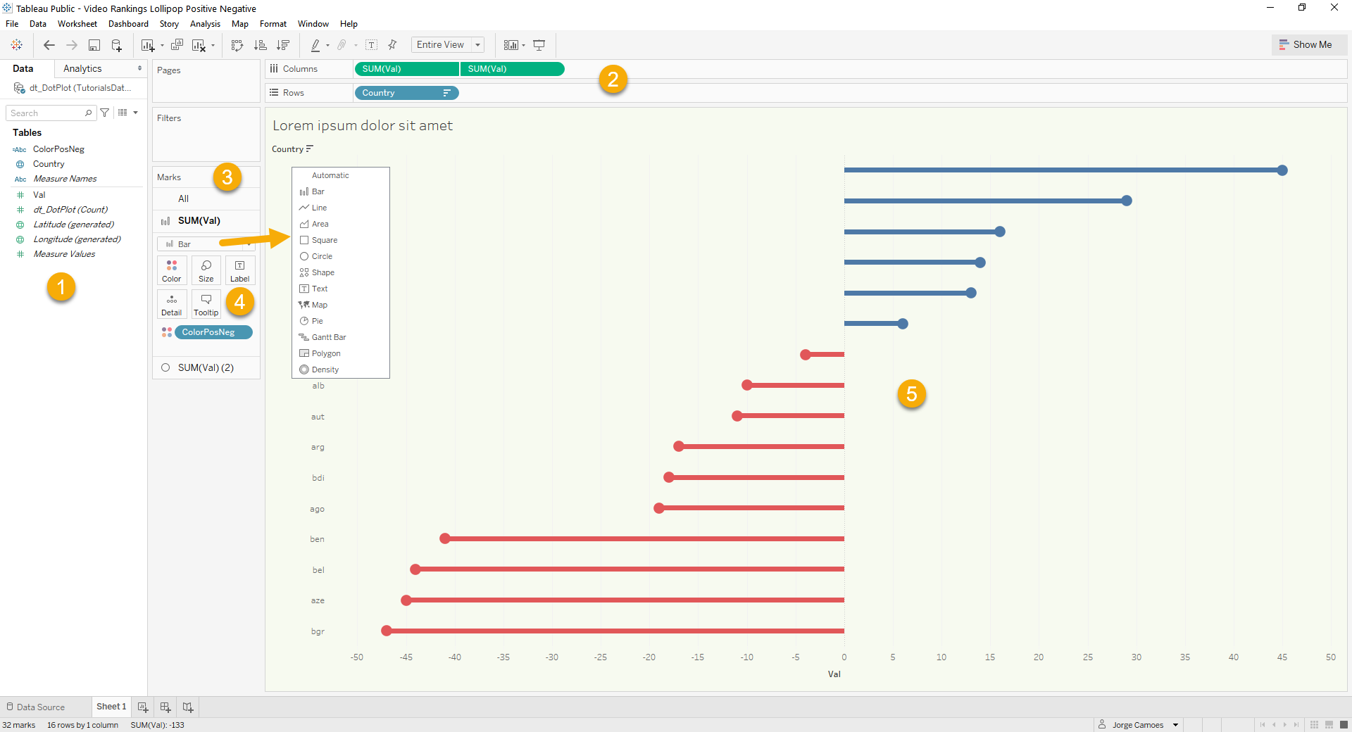
As you can see in the image above:
- All the current data fields are listed on the left panel (1);
- To associate them with the axes, you can drag and drop them on the area at the top (2);
- Marks are the shapes you want to use to display the data points (3).
- You can change their characteristics (4) by defining them manually or assigning a new field (drag a field and drop it on the square).